Harman Style Guide Guidelines
Guidelines contain the information necessary to implement the HMI of features and functions as outlined in the strategies section.
Page contents:
Typography
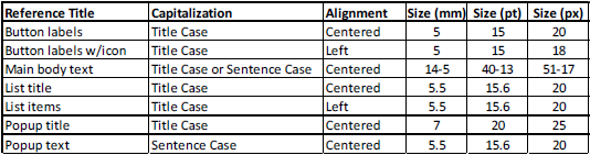
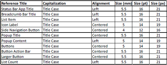
Below are reference text guide tables for each HU. Text size is first determined in mm so it can be measured objectively without consideration of resolution, rendering, or font differences. Sizes in pt and px are given only as reference. All final
text must be measured in mm to ensure it meets the best practice minimum.
VP2 5”
VP3/4 6.5”
VP3/4 8.4”
Top
Scroll Bar/Page Up and Down
Text Lists
List shall be controllable while on screen by using the turn knob on the radio hard key control panel.
The app shall manage scrolling smoothly. Rotating the radio control knob right (clockwise) shall navigate lower in the list. Rotating the
radio control knob left (counter clockwise) shall navigate higher in the list.
The list item will have a cursor to the indicate position to the user. The cursor for 3rd party branded apps shall match the app branded coloring. The cursor
for Uconnect branded apps shall match the vehicle brand color.
The list item will have a pressed state to indicate to the user that an action is to be performed. This is shown by a white line on above and below the list item. The pressed
state should be shown when with the soft key or hard key was uses to select a list item.
When the user releases the button/soft key the select item shall change state to show it has been selected. The selected state is shown by placing
the cursor on the selected item.
Pressing the control knob shall allow the user to select the item the cursor is currently on.
As a user navigates deeper into a list level, pressing the back button shall take the user back one level
to the previous location in the list.
The cursor shall maintain the position on the screen when the user scrolls by page.
If the final page is not fully populated and the previous cursor position does not have a valid entry then the
cursor shall be placed on the last item in a list.
The cursor shall default to the top of the list up entry to the list.
The list shall not be circular.
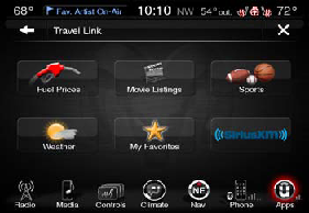
Icon Lists
Rotating the radio control knob right (clockwise) shall navigate the tiled icon highlight in a left to right, top to bottom sequence. Rotating the radio control knob left (counter clockwise) shall navigate the tiled icon highlight in a right to
left bottom to top sequence.
The icon will have a cursor to the indicate position to the user. The icon will have a pressed state to indicate to the user that the action is being performed. The cursor for 3rd party branded apps shall match
the application branded coloring. The cursor for Uconnect branded apps shall match the vehicle brand color.
The list item will have a pressed state to indicate to the user that an action is to be performed. This is shown by outer glow.
The pressed state should be shown when with the soft key or hard key was uses to select a list item.
When the user releases the button/soft key the select item shall change state to show it has been selected. The selected state is shown
by placing the cursor on the selected item.
Pressing the control knob shall allow the user to select the item the cursor is currently on.
As a user navigates deeper into a list level, pressing the back button shall take the user back
one level to the previous location in the list.
The cursor shall maintain the position on the screen when the user scrolls by page.
If the final page is not fully populated and the previous cursor position does not have a valid entry
then the cursor shall be placed on the last item in a list.
The cursor shall default to the first item of the list up entry to the list.
The list shall not be circular.
Note: The HU receives the relative position of the scroll
knob every 250ms from the ICS (cluster). This will include the direction the knob has rotated and the number of detents it has rotated. The spec states that this parameter should be optimized by a parameter tuning process during integration
testing. For apps running in java this would have to be completed.
Top
Buttons
Buttons
Buttons can be used throughout the interface and on popups.
Single buttons that are not used in a button action bar should be strategically positioned so the user can identify the button, access posting to use the button, and maintain consistency
with HU OS layouts.
There are two sizes of commonly used buttons in the HU.
Smaller buttons are commonly used in the screen on the right or left sides between button action bars. These buttons are commonly used to change sources or views within a HU OS category.
Larger buttons are commonly used in the center of
the screen. These buttons are commonly used for main functions or actions within a HU OS category.
Button Content
As much as possible, maintain consistency in the size of each button’s contents.
A button can contain text, images, or an image with text.
Text labels must fit on the button and may not be truncated. Note that translations are typically
longer than English words and require more space.
Top
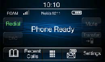
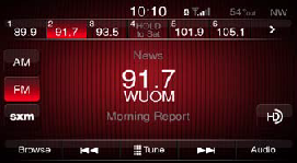
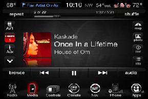
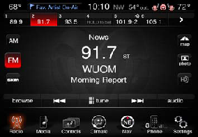
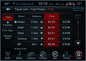
Button Action Bars
Button Action Bar
A button action bar is a linear set of buttons, each of which functions as a button that can display a different view (navigate to different features or settings of the app), display available functions (show tools or buttons that allow app control),
or display customized content (show presets or predefined app content). A button action bar can be located on the bottom or top of the screen.
The width of the buttons in the button action bar is determined by the number of its buttons;
the height and length of a button action bar is fixed. The width of each button is proportional, based on the total number of buttons. When users tap a button, the button displays a selected appearance. Use a button action bar to offer closely
related, but mutually exclusive choices. Make sure that each button is easy to tap to maintain a comfortable hit region. A button action bar should have no fewer than two buttons. If only one button is required, that button should follow the
button guidelines.
Button Content
As much as possible, maintain consistency in the size of each button’s contents. Because all buttons in a button action bar have equal width, it does not look good if the content fills some buttons, but not others. A button action bar button can
contain text, images, or an image with text. Only one of these paradigms can be utilized for the entire row, meaning that if image and text labels are used in one button all buttons must use that approach. Text labels must fit on the button
and may not be truncated. Note that translations are typically longer than English words and require more space.
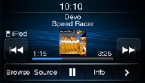
Action Bar
Bottom Bar: Buttons should be actions within the page of the app, that influence the current state of the app. Example Action Functions: Play/Pause, Seek, Settings Shortcut, Browse, Tune.
Second Action Bar
Bottom Bar: If there are more options that fit into one action bar, a > is placed in the far right button, this takes the user to the second page of options and becomes a < button. Pressing the < button will take the user back to the
main page or it will timeout after 10 seconds back to the main page.
Progress, Overall Options
Top Bar: Buttons should be options consistent within that app, such as presets, or progress information of that app.
Top
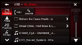
Category Tabs/Side Navigation Buttons
Category Tabs
Category tabs are typically used with lists. Each of the category tab buttons function to change the list display to a different list view. List views can enable navigation to different levels of content or separate menus or features of the app.
For example, category tabs can allow a user to view available content per category, browse selections for content by category, and access separate but similar feature content by category within an app. If the user drills down in a browse category,
pressing that category tab button again will return the user to the top of that category tree, at the top of the list.
The length and width of each button is fixed. A maximum of 5 category tab buttons can be shown on one screen and a maximum
of two sets is allowed. The bottom button will function as a navigational tool to view additional categories if there are more than 5 categories. This button would display a down arrow on the first screen and if more category tab buttons are
available and an up arrow on the second screen. Do not allow the category tab buttons wrap. This means that a maximum of 10 category tab buttons can be used with one navigational tool arrow button per screen. Navigational tool arrow buttons
are to maintain their button position, the bottom button. If there are less than 8 categories, blank spaces will occur between the 6th category and the up arrow navigational tool on the second screen. There should be no less than 2 category
tab buttons. If only one button is required, that button should follow the button guidelines.
When users tap a button, the button displays a selected appearance. Use category tab buttons to offer closely related, but mutually exclusive
choices. Make sure that each button is easy to tap to maintain a comfortable hit region.
Side navigation buttons can be used to go back to the first page of browse, refresh data in list, select all/none, and access ABC jump.
Button Content
As much as possible, maintain consistency in the size of each button’s contents. Because all category tab buttons have equal width and height, it does not look good if the content fills some buttons, but not others. A category tab button can contain
text, images, or an image with text. Only one of these paradigms can be utilized for the entire column, meaning that if image and text labels are used in one button all buttons must use that approach. Text labels must fit on the button and
may not be truncated. Note that translations are typically longer than English words and require more space.
List Sorting Tabs
List sorting tabs are commonly used when lists can be ordered alphabetically and in other order such as recently used, by rating, by date, or by distance. When a user presses a sorting tab the list would reorder according to the criteria of that
tab and return the user to the top of the list.
Sorting is remembered between ignition cycles. Default sort is by is alphabetical, in the order of symbols, numbers, and letters.
List sorting tabs are centered above the influenced lists.
Selected list sorting tab is displayed in the pressed button state.
Top
Lists
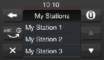
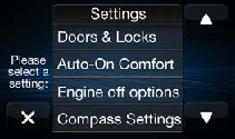
Text Lists
A text list displays data in rows that can be divided by section or separated into groups. You can use a text list to display large or small amounts of information cleanly and efficiently.
For example, you can use a text list for:
Help Screens, Questions, Settings, Change Settings, Information, Listed Selections, Main Menus, Details.
A text list can display a list of choices users see when they tap an item in a text list and to display a list of choices users see
when they tap a button or other UI element that is not in a text list.
Each list item can lead to a different subset of information displayed in another list. Users follow a path through the hierarchy by selecting one item in each
successive list.
Icons in a Text List
Icons can be used in a list to the left of the text to facilitate recognition of common list items according to content. For example, brand icons, station logos, or commonly used symbols of function can be placed before the text on a line item.
Icon Lists
Center content within an icon area both horizontally and vertically.
Icon Area Labels
Text labels must fit within an icon area and may not be truncated. Note that translations are typically longer than English words and require more space.
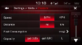
Selection List
A selection list is a page that contains list of options in which selections or settings can be made. Items from the list will appear using the predefined sort order, such as alphabetical order.
Selection lists can be used for such actions
as favoriting the item, deleting the item, turn the item on or off, or other options.
Multiple Selection List
A multiple selection list is a page that contains list of options in which multiple selections can be made.
When a list item is selected, the line will highlight. Once a user has selected a list item, a done button will be presented where
the back arrow is located. When the done button is selected, the selection list will close.
Directive Text
Direction text is placed in the middle of the left side of the screen. Direction text instructs the user regarding the selection list items. The direction text should be relevant to the title bar content.
Top
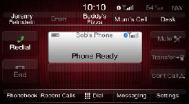
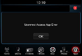
Popups
Popups
Ensure that only one popup is visible on screen at a time. You should not display more than one popup at the same time. In particular, you should avoid displaying a cascade or hierarchy of popups simultaneously, in which one popup emerges from
another.
Shading/tinting will be used along with an outline to cover the active parent screen to not allow the user to interact with the parent screen.
Popup Buttons
Close Button
Icons can be used in a list to the left of the text to facilitate recognition of common list items according to content. For example, brand icons, station logos, or commonly used symbols of function can be placed before the text on a line
item.
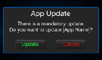
Choice Buttons
If the popup requires a choice button such as “Yes” and “No” or “Yes” and “Cancel”. A choice button popup could also include a shortcut to another area of the interface to perform an action. The affirmative choices will be displayed in green
text and the negative choices will be displayed in red text. Affirmative button options are located on the left and negative button options are located on the right.
Timeout
Some popups do not have any buttons and timeout. These popups usually occur in speed lockout conditions or when a button press or interface interaction is not recommended.
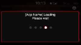
Popup Progress Indicators
Use a progress indicator popup when a time-consuming operation interrupts the UI for longer than two seconds, so the user understands that the system is working and progress is being made.
The system progress indicator uses dots that have
a 1 second refresh rate.
The active state of a dot will be the colored based on the brand of the app or in the event that information is unavailable to the application it will be the generic active version.
Other progress indicators
such as a bar or loop can be implemented in place of the indicator dots if they are follow a similar refresh rate that is not considered animation.
Top
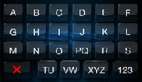
ABC Jump
ABC Jump
ABC jump is used to browse or navigate the currently active category or section of content.
If the ABC jump feature is available, present the ABC jump button on the browse screen or content selection screen. Pressing the Alpha Jump button
brings up a pop-up with a speller.
Pressing one of the characters closes the Alpha jump view and jumps to according position in the list (first item starting with chosen character). Default is to show alphabet. Pressing 123 toggle button
brings up set of numbers and toggle button label changes to A-Z.
This is an intelligent alpha jump, meaning that only buttons available characters are shown in available state.
Alpha jump button on browse screen is greyed out when
list is not in alphabetical order (e.g. numbered track list).
Alphabetical lists order should have the following priority: symbols, numbers, letters.
The only exception to the alphabetization is for artists lists in player, which ignores
“The” before an artist name when alphabetizing.
- Symbols should be ordered by their Unicode value (with the exception that space is first).
- Numbers should be ordered by their Unicode value.
- Letters should be alphabetized in a two-state method. First, alphabetize by the stripped down version of the letters, i.e. convert international and capital letters to the lower case letter base version of that letter (e.g. ö becomes
o). Next, if there are two or more entries that have the exact same base entry, use the letter’s non-stripped Unicode value to disambiguate the order. For example, if the database has motorhead, Motorhead and, Mötorhead, they would
all have the same base version (motorhead). The unicode value of the first character (m vs M) would place Motorhead and Mötorhead ahead of motorhead. Next, between Motorhead and Mötorhead, the unicode value of o is less than ö
and so Motorhead would appear before Mötorhead. The final list order would be Motorhead, Mötorhead, and then motorhead.
Note: The ABC jump letter keys can be grouped if necessary to enable rapid search fucntions for specific content. For example with the list of the United States, the letters “M” and “N” would bring up a larger list that would be better served if each
letter was separate, whereas the letters “X” and “Z” would not.
Top
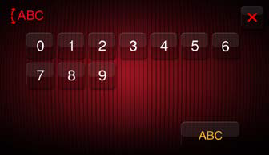
Keyboard
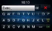
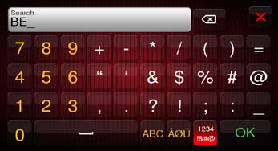
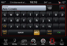
Keyboard
A keyboard is used for typing selections, search items, and other entry text. A keyboard is displayed when a text field is selected or a search button is selected in the currently active category or section of content.
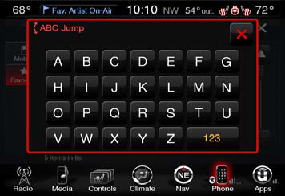
Text Field
A text field accepts a single line of user input (shown here with a purpose description and placeholder text). A text field is a fixed-height field with rounded corners. When users tap a text field a keyboard appears; when users tap Return in
the keyboard, the text field handles the input in an application-specific way.
The text input fields for all keypads and spellers should present a black cursor using the “_” underscore character to show where the text would appear if the
user types in a character. Use a text field to get a small amount of information from the user.
Display a hint in the text field if it helps users understand its purpose, such as “Name” or “Address.” A text field can display such placeholder
text when there is no other text in the field.
Pressing 123 toggle button brings up set of numbers and special characters and toggle button label changes to A-Z. Default is to show alphabet.
User can choose after how many character
entries he/ she wants to search. When pressing enter or ok, a list with all search results is shown. The user can either press on a search item in order to leave search or select the text field or search button to perform another search. SPELLER
shall be intelligent. Search is not case sensitive.
International characters shall be searched if base character is searched for.
If search string includes ‘a’, all forms of ‘a’ shall be included in search (e.g. A, À, Á, Â, Ã, Ä, Å, Æ, a, à, á, â, ã, ä, å, æ.
If search string includes ‘e’, all forms of ‘e’ shall be included in search (e.g. E, È, É, Ê, Ë, e, è, é,
ê, ë).
If search string includes ‘i’, all forms of ‘i’ shall be included in search (e.g. I, Ì, Í, Î, Ï, i, ì, í, î, ï).
If search string includes ‘o’, all forms of ‘o’ shall be included in search (e.g. O, Ò, Ó, Ô, Õ, Ö, Ø, o, ò, ó, ô,
õ, ö, ø).
If search string includes ‘u’, all forms of ‘u’ shall be included in search (e.g. U, Ù, Ú, Û, Ü, u, ù, ú, û, ü).
Similarly, ‘C’ will find C, Ç, c, ç. ‘ss’ will find ß. ‘Y’ will find Y, Ý, y, ý. ‘N’ will find N, Ñ, n,
ñ.
This character list may not be exhaustive.
The caveat for search is that if the user selects a specific international character in the search string (e.g. Ã), search will only look for that version of that character (ignoring
case). The system shall display the international characters in search results.
Top