Harman Style Guide Strategies
Strategies describe implemented system behavior to provide app developers information to integrate apps and the features thereof into the system.
Page contents:
System Navigation
Main System Category Controls
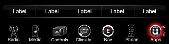
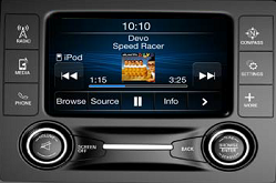
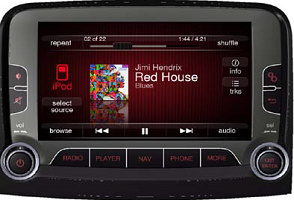
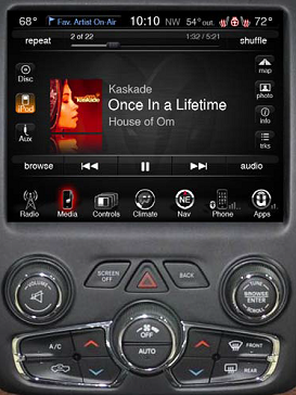
The system is navigated by category controls. Apps reside in the Apps/More category.
Radio: Access to Radio main page if not currently on Radio main, except if on browse screen and user goes to either Climate or More screen, when pressing
Radio again user goes back to previous browse screen not radio main. If on radio main, will cycle through the available radio bands (AM, FM, SXM/DAB).
Media: Access to Media main page if not currently on Media main, except if on browse
screen and user goes to either Climate or More screen, when pressing Media again user goes back to previous browse screen not Media main. If on Media main, will cycle through the available (connected) sources (Disc, USB, Aux, BTSA).
Phone:
Access to Phone main page (BT connected phone).
Nav/Compass: Access to Navigation main page or compass.
Controls: Access to Controls main page (heated seats, sunshade, etc.).
Climate: Access to Climate main page.
Apps/More:
Access to Apps list or More screen (CVP apps, embedded features such as settings).
Audio Attenuation
Apps with audio streaming always take priority over other apps if memory requires apps to be stopped. If an app is streaming audio, and another app is launched which streams audio as well, the most recently executed app wins over the previous
app which is stopped. If an app is streaming audio, and another app is launched which intermittently plays audio (e.g. nav prompt, score updates, email reader etc.), the streaming audio app is not stopped. Rather, its streaming audio is paused
(if possible) or attenuated.
Top
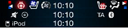
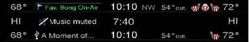
Status Bar
Status Bar
The status bar always appears at the upper edge of the screen and contains information people need, such as the controls status, climate status, the time of day, and the outside and driver/pass temp.
Status bars will be shown when in apps.
Do not hide the status bar. Don’t create a custom status bar. Users depend on the consistency of the system-provided status bar.
Streaming audio apps can place the icon and name of the app in the status bar where media and radio information
is displayed.
Displayed status bar content for HU OS categories, is de-contented dependent upon which category the user is currently in.
Streaming audio app information would only be displayed when a user is not in a media app screen.
Streaming
audio apps must be currently running under the audio arbitration rules to populate the status bar.
A definite number of characters is NOT defined because the maximum number of characters that can be displayed varies with the character
width. Margins must be defined to determine how many characters can fit.
Status Bar Content
- Outside Temp
- Radio/Media/Call Time/App Information
- Time (optional)
- Controls Status (driver/pass heated/vented seat, heated wheel, dual view)
- Climate Status (driver/pass temp)
Status Bar Shortcut
Touching the Radio/Media/Call Time/App section of the status bar takes the user to the main screen of the current audio source. If the current audio source is an audio streaming app, user is taken to that app’s landing page. This area is inactive
during MUTE.
Top
Hard Controls
Volume/Mute
Turning Knob = increase/ decrease Volume. Independent of currently shown screen, turning the knob brings up VOLUME POP-UP.
Pressing Knob = toggles between Mute on and off.
When Mute is on, any app audio shall also be muted. Audio streaming
apps with Pause functionality shall pause when Mute is active, and unpause when Mute is deactivated.
The following conditions cancel mute status:
Pressing Mute knob again, toggling it off.
Any user action within app which can be categorized as one which deliberately requests audio.
Chrysler HMI must be consulted when categorizing these actions.
Examples of actions which deliberately request audio: Press play, skip to next track, change source, select item from list.
Examples of actions which are not deliberately requesting audio: Browsing a list of content, viewing track info,
adjusting settings.
Back Button
The functionality of the Back hard control mirrors that of the Back soft control. If the Back soft control is available on the screen, the Back hard control has the same functionality as the Back soft control in that instance.
If the Back
soft control is greyed out on the screen, or is not currently shown on the screen, the Back hard control is inactive, and if pressed error tone is played.
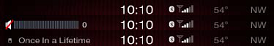
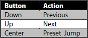
Scroll Knob/Enter
Turning Knob = TUNE up/ down or SKIP to previous/next.
Turning Knob when viewing a list = scroll up/ down a list.
Pressing Knob = open browse.
Pressing Knob when browsing list = select item. If list item is a track, the system starts
playing that track and automatically goes to the app’s main screen.
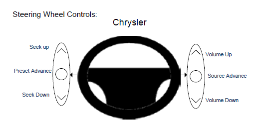
Steering Wheel Controls
Steering wheel controls shall be used where applicable shall be used.
The switches on the left side of the steering wheel shall be defined as follows:
Top
Consistency
Consistency
Consistency in the interface allows users to transfer their knowledge and skills from one app to another. A consistent app is not a slavish copy of other apps. Rather, it is an app that takes advantage of the standards and paradigms users
are comfortable with.
- The app must be consistent with UI standards.
- It must use system-provided controls, views, and icons correctly.
- It incorporates device features in a reliable way.
- The app is consistent within itself.
- Text use is uniform in terminology and style.
- The same icons always mean the same thing.
- Users can predict what will happen when they perform the same action in different places.
- Custom UI elements look and behave the same throughout the app.
- Within reason, the app is consistent with its earlier versions.
- Terms and meanings remain the same.
- The fundamental concepts are essentially unchanged.
Feedback
Feedback acknowledges user’s actions and assures them that processing is occurring. Users expect immediate feedback when they operate a control, and they appreciate status updates during lengthy operations.
The apps respond to every user action
with some perceptible change.
Subtle animation can give users meaningful feedback that helps clarify the results of their actions. For example, lists can animate the addition of a new row to help users track the change visually.
Sound
can also give users useful feedback. But sound shouldn’t be the primary or sole feedback mechanism because users may use their devices in places where they can’t hear or where they must turn off the sound.
User Control
Users, not apps, should initiate and control actions. Although an app can suggest a course of action or warn about dangerous consequences, it’s usually a mistake for the app to take decision-making away from the user. The best apps find the correct
balance between giving users the capabilities they need while helping them avoid dangerous outcomes.
Users feel more in control of an app when behaviors and controls are familiar and predictable. And, when actions are simple and straightforward,
users can easily understand and remember them.
Users expect to have ample opportunity to cancel an operation before it begins, and they expect to get a chance to confirm their intention to perform a potentially destructive action. Finally,
users expect to be able to gracefully stop an operation that’s underway.
Top
Text
Maximum Number of Characters
A definite number of characters is NOT defined because the maximum number of characters that can be displayed varies with the character width. Margins must be defined to determine how many characters can fit on the button, list line item, or title
area. Button labels cannot be truncated. Alternate terms or icons may be necessary to fit on a button. If dynamic text does not fit within a list line item ‘...’ is placed at the truncation, ensuring the meaning is still understood and visible
lettering is appropriate. Note that translations are typically longer than English words and require more space.
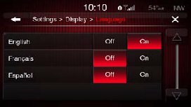
Translation Best Practices
Language translations shall be done using current translations of the core HMI (as possible).
Language translations shall be done with use context, screenshots/models and definition of terms.
The translation service shall provide text
based on the available space; this could mean phrases, whole words, or abbreviations.
The translated HMI shall be iteratively user-tested with native speakers for comprehension, with their input being considered for the final translated
text.
The translation service shall provide support throughout the translation iterations based on user testing results.
Top
Button States, Press Behavior, and Sound
|
Button States
Active
Normal: not selected but available.
Pressed
Down State: a user is pressing the button.
Selected: button had been pressed and has maintained the pressed state because it is a selection (Branded highlight color). The pressed state of a button will be the colored based
on the brand of the app or in the event that information is unavailable to the application it will be the generic pressed version.
Locked
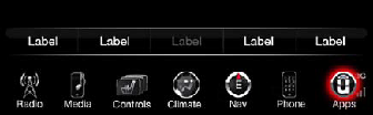
Unavailable: feature or function is not available for selection.
Buttons for a function that is either unavailable or locked out should have greyed out labels (text and icons). Presses of unavailable icons should play Error
tone. If the function is unavailable due to speed lockout (driver distraction), a press should also display the popup “function not available while the vehicle is in motion”.
Button Press Behavior: Long Press and Press & Hold
Store presets: Press & hold preset button for 2 sec. to set new preset.
Seek: Long Press Seek for 500 ms to seek faster.
Skip: Long Press SKIP for 500 ms sec. to FF/RW.
List Navigation: Long Press up/down arrows
for 500 ms to move faster. Faster is to advance one page per 500 ms.
Level adjustments: Press & hold of longer than 500 ms causes the system to increment/decrement by at a rate of 1 step each 200 ms.
Action Confirmation Sounds
Distinctive Feedback Sounds are needed for:
- Successful activation of touchscreen control (on press) - Success tone
- Failed activation of touchscreen control (on press) - Error tone
- Preset Set etc. (once set) - Confirmation tone
|
|
Top
List Navigation and Tools to Find Content
Breadcrumb Bar/Title Bar
A breadcrumb bar enables navigation through an information hierarchy and management of screen contents.
A title bar provides information of screen contents. A title bar usually displays the title of the current screen or view, centered along
its length. A title bar can be used to provide context or direction to the user for the content below.
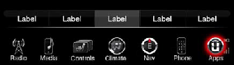
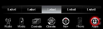
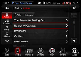
Category Tab Buttons
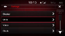
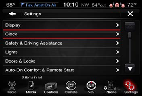
Category tab buttons are a linear set of buttons that are placed on the left side of the screen. Category tab buttons are typically used with lists. Each of the category tab buttons function to change the list display to a different list view.
List Sorting Tabs
List sorting tabs are used to change the way lists are ordered to enable a user to find a selection quickly.
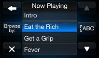
ABC Jump
The ABC Jump popup tool can enable a user to find content quickly in a list or perform a search for content.
Keyboard
A keyboard is used for typing selections, search items, and other entry text. A keyboard is displayed when a text field is selected or a search button is selected in the currently active category or section of content.
Scroll Bar/Page Up/Down, Scroll Knob and Back Button
Scroll bar functionality and indicator will be used when the list is larger than the vertical display area.
If content on a screen extends vertically beyond the viewing area, scroll arrows buttons appear in the active state.
When a user
is browsing or making detailed selections, using the back button takes the user back to the previous list screen.
Top
Selecting List Items
Pressed List Item State
The list item will have an pressed state to the indicate to the user that the action is being performed. The pressed state of the list item will have an outer glow utilizing the brand color. When users touch the screen, they interact directly
with items on the screen using a finger. When users interact with an item, the highlight helps them identify the item that they are initiating the action on.
List Item Cursor
When users use the scroll knob, they use the cursor to identify the item that they are initiating the action on. Users press the scroll knob to initiate the action and turn the scroll knob to move the cursor in the list. If the list item has selections
within it, the user will turn the scroll knob to align the cursor on the item, press the scroll knob to lock in on that item, and then turn the scroll knob to cycle through the selections. When finished, the user presses the knob to unlock
the the scroll knob off the current item.
Selecting Behavior
Always provide feedback when users select a list item. After selecting a list item, users expect an immediate action to occur: Either a new view appears or the row displays a focus/highlighting item to indicate that the item has been selected
or enabled.
A list row highlights briefly when the user taps a selectable item.
If a row selection results in navigation to a new screen, the selected row highlights briefly as the new screen opens.
If user drills down another
path, pressing back provides the user with the previous list position and cursor position.
In most cases, give users only one path to a screen. If a screen needs to be accessible in different circumstances, consider using a modal view
that can appear in different contexts.
Pressed Icon State
The icon will have an pressed state to the indicate to the user that the action is being performed. The pressed state of the icon will have an outer glow utilizing the brand color. When users touch the screen, they interact directly with items
on the screen using a finger. When users interact with an icon, the highlight helps them identify the item that they are initiating the action on.
Icon Cursor
The icon will have a cursor to the indicate position to the user when they are using the scroll bar to navigate the icon list. The cursor will go to left to the right and down when the scroll knob is turned as they do to go down in a text list.
When users use the scroll knob, they use the cursor to identify the icon that they are initiating the action on. Users press the scroll knob to initiate the action and turn the scroll knob to move the cursor in the list.
Selecting Behavior
Always provide feedback when users select a list item. After selecting an icon, users expect an immediate action to occur: Either a new view appears or the icon displays a focus/highlighting item to indicate that the icon has been selected or
enabled.
An icon highlights briefly when the user taps a selectable item.
If an icon selection results in navigation to a new screen, the selected icon highlights briefly as the new screen opens.
If user drills down another path, pressing
back provides the user with the previous list position and cursor position.
In most cases, give users only one path to a screen. If a screen needs to be accessible in different circumstances, consider using a modal view that can appear
in different contexts.
Top
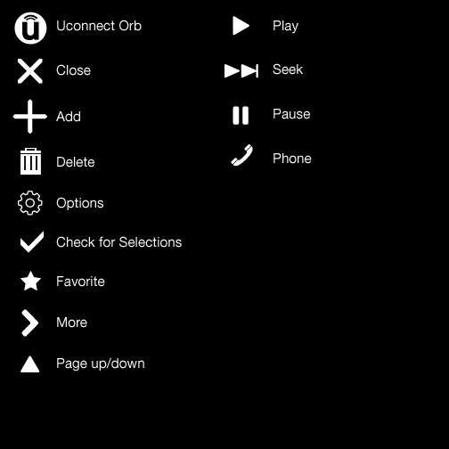
Iconography
Iconography
The head unit uses a number of icons across the user interface to create and maintain consistency throughout the head unit experience. Samples of standard icons are shared on this page. This list will inevitably grow and change as the head unit
is being developed. The icons can be used layered on buttons or as on screen elements.
Top
